In this edition of the Weekly Cornerplay, Jeffrey Yuwono checks out the Apple Watch and concludes it’s not the watch Jobs would have made
 The Apple Watch is something I’ve been anticipating — Apple is the undisputed opinion leader of the gadget industry and its entry legitimises this nascent category. Apple did a lot of things right with the Apple Watch, but it’s not one that Steve Jobs would have made. This is Tim Cook’s and Jony Ive’s Apple Watch. I don’t mean that disrespectfully, or claim that I commune with Steve Jobs in the afterlife to know what he’s thinking. He’s a narrative device to help frame the story. Jobs was famous for his insistence on focus and simplicity, but the Apple Watch revealed earlier this week isn’t those things. He would have made the Apple Watch software beautiful and cohesive; it would likely only have one button instead of two; and it wouldn’t have so many customisations on day one. Confusing software As I sat through the keynote and various demos for the Apple Watch, I found myself with an unfamiliar feeling regarding Apple’s mobile products: confusion. I was confused by Apple Watch’s software, and I know why. There’s no consistent design language. Also, it’s kinda ugly. This would’ve never happened under Jobs’s watch. Here’s what Android Wear looks like:
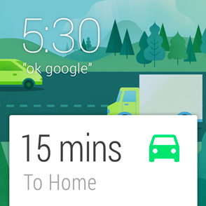


![]()


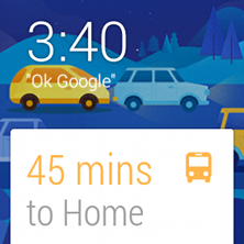 And now Android Wear in motion:
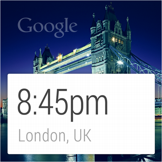
  These screens belong to one another. You can tell you’re looking at an Android Wear watch, and things flow in a cohesive and integrated manner. When it’s this tightly designed, it doesn’t feel overwhelming. Like you know you’re being guided down a nicely planned path. It’s also quite pretty. Good job, Google! Now check out the Apple Watch:


 The images look random, like different people designed something on their own without adhering to any consistent layout and then threw everything together into one giant mess. The background is black and the font is boring; that’s about all these screens have in common. When everything is different, it appears complex and visually overwhelming. When something looks overwhelming, the brain surrenders and confusion sets in. Also Read: Apple unveils iOS 8 and a tonne of goodies at this year’s WWDC Also, is it just me, or is Apple Watch software just plain… ugly? Like it was designed during the 90s? This is very unlike Apple. And certainly unlike Jobs. Jobs would have swooped in with an iron hand and insisted everything — at least Apple’s own apps — conform to one design language. Something that screams, “This is Apple Watch”, like iPhone apps did when they were first launched. And at the very least, he would have made it look beautiful. Two buttons
  A basic design principle is to promote what you think is important and to put into the background what’s less important. On the iPhone, the home button and, therefore, the home screen is central to the user experience. That’s what comes first. The Settings section, for example, is relatively buried as an icon on the home screen. Apple could have made Settings accessible via a hardware button but it chose not to. Other buttons, like volume, lock, etc. are hidden away on the sides. Spiritually, the iPhone only has one button. The original iPhone had a 3.5-inch screen, while the Apple Watch’s screen is roughly 1.65 inches. Despite less room, the Apple Watch has one more primary button than the iPhone. Jobs was famous for his insistence on simplicity: having two main buttons on the Apple Watch is not consistent with that philosophy.
  The first button on the Apple Watch — the digital crown — is smart. Touch still works on the watch, but it’s not ideal because it leaves fingerprints and because so much of the view is obscured with your finger there. The digital crown provides a control mechanic that avoids both things. Clicking the crown brings you to the home screen of the Apple Watch. Apple clearly considers this an integral part of the watch experience.
  The second button is a shortcut to a personal messaging app, where you are presented with your friends’ avatars. Tap on one and you can send emoticons, drawings, pulse-like vibrations and yes, even your heartbeat. It’s interesting that Apple gave this feature one of two hardware buttons. You can argue that Apple considers this even more important than time itself. To get to your watch face, you have to press the digital crown and select the watch app. To get to the personal messaging app, just press the button. Promoting this feature as one of two hardware buttons is a major design decision.
 Unlike the digital crown, I don’t think the second button is smart. Let’s assume I actually want to message friends on this small screen. How many of my friends could I actually message? Less than half of my friends own an iPhone. What percentage of that will buy an Apple Watch? And further, what percentage of those who purchased one will wear an Apple Watch frequently enough that I can be sure my messages will reach them in a timely manner? Also Read: Weekly Cornerplay: The Surface Pro 3 was a coin flip One of two main buttons on this tiny device will hardly ever be used. I used Messaging and FaceTime a lot on the iPhone. And Apple didn’t give those apps hardware buttons. Sure, if the receiver doesn’t have the Apple Watch, they might, for example, get the drawing as an email on their Android phone. But that’s not a new type of personal messaging made possible only with the Apple Watch; that’s just an awkward email. The personal messaging app on the Apple Watch might be cute, it might be useful, but it definitely doesn’t deserve such prominent placement. Jobs would have insisted on its exclusion as a button. The digital crown is smart. But the personal messaging button is not. Endless customisation Fortunately, it’s not all negative. Cook and Ive did do something right that Jobs probably wouldn’t have done: the seemingly endless amount of customisation possible for the Apple Watch. In this case, going against a Jobsian philosophy is a good thing.
  When Jobs took over an ailing Apple back in 1997, he famously cut the product line to focus on just a handful. It took three generations before even iPhones got more than one colour. With Jobs, focus and simplicity were paramount. Yet, the Apple Watch will launch with three lines — Standard, Sport and Edition — come in two sizes (42mm and 38mm), six different finishes and feature six types of straps, some of which have different colours. There are hundreds, if not thousands, of possible combinations. Add to that all the different watch faces, and there are effectively millions of different looks. Apple has never launched a first generation product with so many variations. It’s not just anti-Jobs, it’s downright anti-Apple. Yet, Cook and Ive nailed the customisation aspect of the Apple Watch. Particularly the straps. I love how Apple implemented the straps, and how easy it is to change them around.
 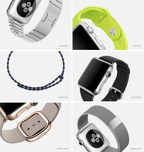 The closing mechanism for some of these straps are of the highest quality.
 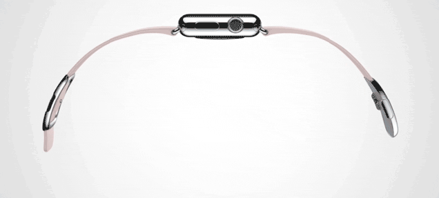 Watches are personal experiences. You wear a watch not just to tell the time, but to express who you are as an individual. Apple saw that a truly mainstream watch can’t be one size fits all. This is a marked contrast to how other companies have approached the smartwatch. You sporty? You may want this.
  If you’re a hipster, this might be more your flavour.
  How about something classy for the wife?
  Perhaps something more feminine…
  Maybe something old school for yourself?
  Or offbeat?
  This elegant version would be great for posh parties.
  There’s even something simple.
  I can continue, but you get the point. The Apple Watch has so many different variations, one is bound to be just right for you.
  The only quibble I have is that the difference between Standard and Sport seems too minor to matter. It’s cognitive overload — Jobs would have insisted on eliminating one of the two to reduce confusion. He may have insisted on doing away with all these other customisations too, but then that would have been the wrong move. For better or worse, this is a different Apple. The author, Jeffrey Yuwono, blogs at the The Cornerplay, a blog about tech, gadgets and entrepreneurship. The views expressed here are of the author, and e27 may not necessarily subscribe to them. e27 invites members from Asia’s tech industry and startup community to share their honest opinions and expert knowledge with our readers. If you are interested to share your point of view, please send us an email to writers[at]e27[dot]co
The post Weekly Cornerplay: It isn’t Steve Job’s Apple Watch appeared first on e27.